Documentation
Vie - Gatsby Creative Portfolio & Agency template
Vie is creative & modern multi purpose template based on react.js & gatsby.js, perfect for creative agencies and business startup. Multiple templates are included in this template with lots of CSS and React animations, a perfect template for business startups, web studio, and digital agencies. All files has been well organized and nicely commented for easy to customize
- Version: 1.0
- Author: ThemesCamp
- Created: 05 Nov, 2022
- Update: 05 Nov, 2022
If you have any questions that are beyond the scope of this help file, Please feel free to contact us via ThemesCamp.
Features
- Build on React.js (No jQuery)
- Build on Gatsby
- Based on Bootstrap 4
- Using SCSS/SASS
- 16+ Hompages Variations
- Dark & Light Mode
- Free Google Fonts.
- Linea Icons
- Fonts Awesome Icons
- Fully Responsive
- Modern and Clean Design
- Easy to Customize
- Awesome Unique Look
- Cross Browser Support
- Clean Code & Speed Optimized
- Free Updates
- No Console Error
- W3C Validated Code
Files Include
vie_gatsby Folder
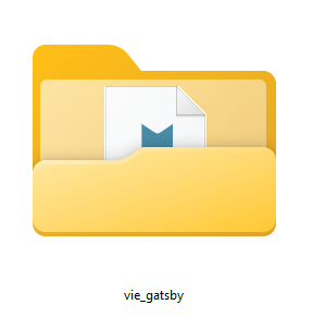
Folder contains main template code & all jsx, json, scss, css, images, fonts, js files
vie-gatsby-docs Folder
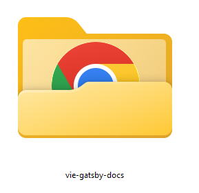
Documentation folder of "vie_gatsby" written in html css
Installation
Follow the steps below to setup your template:
-
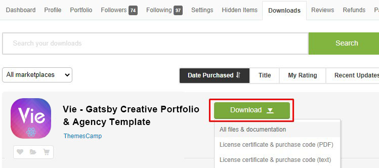
Download the latest theme source code from the Marketplace.
-
Download and install Node.js and npm from Nodejs. The suggested version to install is
LTS.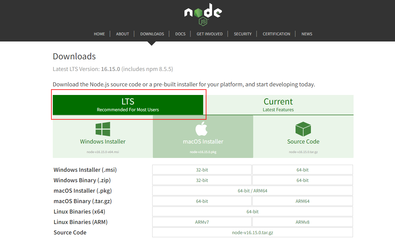
-
Open terminal in vie_gatsby template folder.
> cd /vie_gatsby/ -
Install npm packages.
You must have to install packages of your project to install all the necessary dependencies, You can do this by running the following command.
> npm install
Run Development Server
Start your app development server to change, update and customize your app.
Run npm start in the terminal from the root of your project to start a dev server
> npm run start
Navigate to http://localhost:8000 to see your app, the app will automatically reload if you change any of the source files.
Build For Production
Build the app for production and make it ready for deployment
Run npm run build to build the project for production.
> npm run build
The build artifacts will be stored in the public directory.
Run npm run serve to run the production build of the project locally.
> npm run serve
Navigate to http://localhost:9000 to see your production version of your app.
Deployment
You can deploy your project to any static hosting or a hosting provider that supports Node.js
We suggest some hosting you can consider to use:


Folder Structure
Vie comes with a flexible file structure that can be easily used for small to large scope projects. This section will explain the entire file structure and how to adapt it to your project.
Root Folder
/vie_gatsby folder contains the whole project folders & files
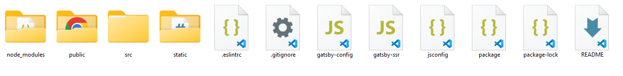
Root Folder Content:
| File/Folder | Description |
|---|---|
.cache |
This folder is an internal cache created automatically by Gatsby. The files inside this folder are not meant for modification. Should be added to the .gitignore file if not added already |
node_modules |
A directory created by npm and a way of tracking each packages you install locally via package.json |
public |
The output of the build process will be exposed inside this folder. Should be added to the .gitignore file if not added already. |
src |
This directory will contain all of the code related to what you will see on the frontend of your site (what you see in the browser), like your site header, or a page template. “src” is a convention for “source code”. |
static |
If you put a file into the static folder, it will not be processed by webpack. Instead it will be copied into the public folder untouched. Check out the assets docs for more detail. |
.eslintrc |
Config file format for ESLint |
gatsby-config.js |
This is the main configuration file for a Gatsby site. This is where you can specify information about your site (metadata) like the site title and description, which Gatsby plugins you’d like to include, etc. Check out the config docs for more detail. |
gatsby-ssr.js |
This file is where Gatsby expects to find any usage of the Gatsby server-side rendering APIs (if any). These allow customization of default Gatsby settings affecting server-side rendering. |
jsconfig.json |
It's a configuration file to assist your editor with the JavaScript usage in your project folder. It's most commonly used to include/exclude folders in your intellisense, and map aliases in your source code to certain folders. |
package.json |
Includes the list of dependencies to install from npm |
Src Folder
/vie_gatsby/src/ source folder that contains all template source files.
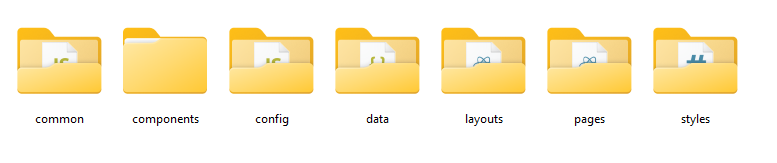
Styles folder doesn't contains the main project styles, it contains overrides styles for some 3rd party packages.
Layouts Folder
/vie_gatsby/src/layouts folder contains all template layouts.
| File | Description |
|---|---|
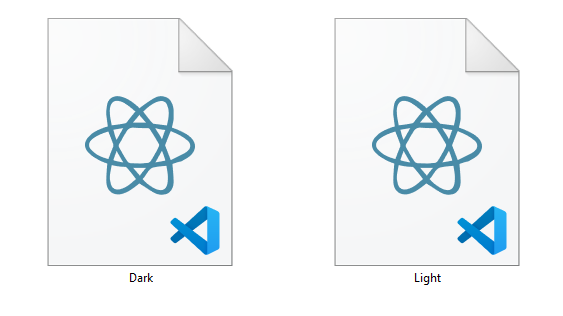
Dark.jsx |
React component represents the Dark Theme layout. |
Light.jsx |
React component represents the Light Theme layout. |
Pages Folder
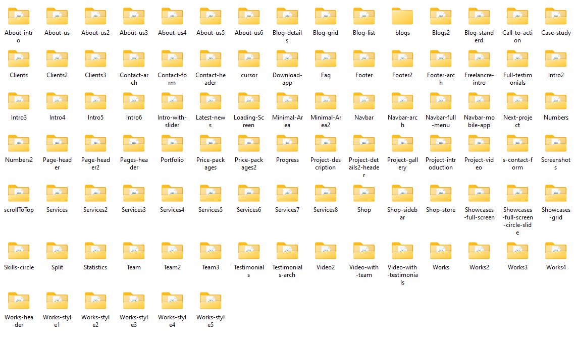
/vie_gatsby/src/pages folder contains template pages files.
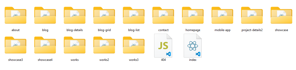
Folders content:
/homepagehome1-dark.jsxhome1-light.jsxhome2-dark.jsxhome2-light.jsx.../aboutabout-dark.jsxabout-light.jsx...
Each file is a react component exported from a .js, .jsx file in the pages directory is associated with a route based on its containing folder name.
Learn more about Gatsby Routing
Components Folder
/vie_gatsby/src/components folder contains template components that imported and used in pages.
Each folder contains a react component that is imported and rendered in some pages component.
Data Folder
/vie_gatsby/src/data folder contains static app data in json format.
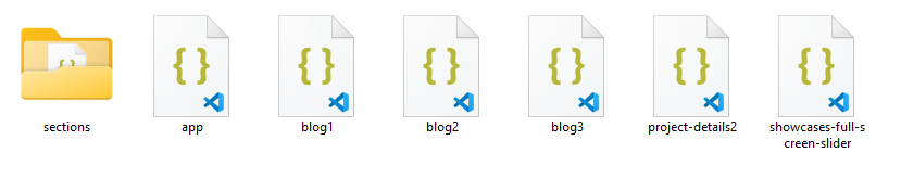
Each file contains JSON data that imported and rendered on it's component.
Common Folder
/vie_gatsby/src/common folder contains common helper functions.
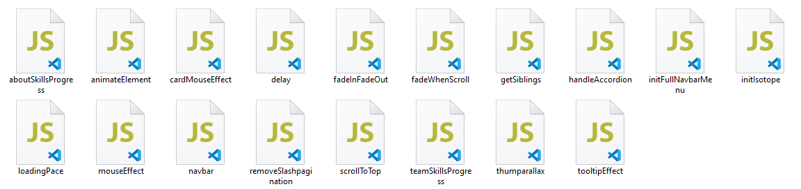
Each file is JavaScript function that is commonly used in project components.
Code Structure
Main template components code structure
Layout
/vie_gatsby/src/layouts/[layout].jsx React component that contains app layout.
// ./src/layouts/Dark.jsx
//= React
import React from "react";
import { Script } from "gatsby";
//= Components
import Cursor from "components/cursor";
import ScrollToTop from "components/scrollToTop";
import LoadingScreen from "components/Loading-Screen";
//= Global CSS
import "styles/main.css";
import "styles/preloader.css";

const DarkTheme = ({ children, useSkin, mobileappstyle }) => {
  React.useEffect(() => {
    window.theme = "dark";

    if (useSkin) {
      let skinCssLink = document.createElement('link');
      skinCssLink.rel = "stylesheet";
      skinCssLink.href = "/css/arch-skin-dark.css";
      document.head.appendChild(skinCssLink)
    }

    if (mobileappstyle) {
      let mobileAppCssLink = document.createElement('link');
      mobileAppCssLink.rel = "stylesheet";
      mobileAppCssLink.href = "/css/mobile-app-dark.css";
      document.head.appendChild(mobileAppCssLink)
    }
  }, [useSkin, mobileappstyle]);

  return (
    <>
      <Cursor />
      <LoadingScreen />
      { children }
      <ScrollToTop />

      <Script src="/js/wowInit.js"></Script>
    </>
  );
};

export default DarkTheme;
Layout component wraps pages content and contains specific configurations such as common components, css or scripts.
components in the imports refers to the src/components folder, Learn more about gatsby-plugin-resolve-src
Page
/vie_gatsby/src/pages/[page_folder]/[page].jsx React component that contains a page code.
// ./src/pages/showcase/showcase-dark.jsx
//= React
import React from "react";
//= Components
import NavbarFullMenu from "components/Navbar-full-menu/navbar.full-menu";
import ShowcasesFullScreen from "components/Showcases-full-screen/showcases-full-screen";
//= Layout
import DarkTheme from "layouts/Dark";

const ShowcaseDark = () => {
  return (
    <DarkTheme>
      <NavbarFullMenu />
      <ShowcasesFullScreen />
    </DarkTheme>
  );
};

//-> Head tag of the page
export const Head = () => {
  return (
    <>
      <title>Vie - Showcase Dark</title>
    </>
  )
}

export default ShowcaseDark;
layouts & components in the imports refers to the src/layouts and src/components folder, Learn more about gatsby-plugin-resolve-src
Component
/vie_gatsby/src/components/[component_folder]/[component_file].jsx React component contains part of a page code.
// ./src/components/Project-description/Project-description.jsx
import React from "react";

const ProjectDescription = ({ projectDescriptionData }) => {
  return (
    <section className="intro-section section-padding">
      <div className="container">
        <div className="row">
          <div className="col-lg-3 col-md-4">
            <div className="htit">
              <h4>
                <span>02 </span> Description
              </h4>
            </div>
          </div>
          <div className="col-lg-8 offset-lg-1 col-md-8">
            <div className="text js-scroll__content">
              <p className="extra-text">{projectDescriptionData.content}</p>
            </div>
          </div>
        </div>
      </div>
    </section>
  );
};

export default ProjectDescription;
Data
/vie_gatsby/src/data/[data_folder]/[data_file].json JSON file stores component data.
// ./src/data/showcases-full-screen-slider.json
[
  {
    "id": 1,
    "title": {
      "first": "Midnight",
      "second": "Snack"
    },
    "image": "/img/portfolio/full/1.jpg",
    "sub": "Design"
  },
  {
    "id": 2,
    "title": {
      "first": "Fisherman",
      "second": "Portrait"
    },
    "image": "/img/portfolio/full/2.jpg",
    "sub": "Design"
  },
  .
  .
]
Source & Credits
Images:
- Pexels - https://pexels.com
- Unsplash - https://unsplash.com
Fonts:
- Poppins - https://fonts.google.com/specimen/Poppins?query=pop
- Roboto - https://fonts.google.com/specimen/Roboto?query=Roboto
Scripts:
- Gatsby - https://www.gatsbyjs.com
- React.js - https://reactjs.org
- Bootstrap 4 - http://getbootstrap.com
- Swiper Carousel - https://swiperjs.com
- react-scroll - https://www.npmjs.com/package/react-scroll
- slick-carousel - https://kenwheeler.github.io/slick
- formik - https://formik.org
- react-circular-progressbar - https://github.com/kevinsqi/react-circular-progressbar
- react-countup - https://react-countup.vercel.app
- react-modal-video - https://appleple.github.io/react-modal-video
Thank you for purchased Vie template
We truly appreciate and really hope that you'll enjoy our template!
If you like our template, plase rate us 5 star !